
From Static Spreadsheets to Actionable Insights:
Longitudinal Performance Analytics
How interactive dashboards transformed multi-year assessment data into actionable insights for school leadership.
Snapshot Overview
👨💻My Role: Sole analyst
🔨Tools: Tableau, Excel
🔢 Data: Multi-year IA & GMAS assessment data (row-level, teacher-grain)
📊Records: 64,000+ student test scores | 400+ teachers | 4 school years
👥Stakeholders: District leadership, instructional coaching teams
🎯Outcome: Replaced manual spreadsheet review with interactive dashboards that enabled trend-based decision-making and prioritized targeted support. This shifted leadership discussions from isolated score review to trend-based coaching decisions, enabling earlier and more targeted instructional support.
The Problem
Problem summary: Leadership had access to years of assessment data, but the format prevented meaningful trend analysis and slowed decision-making.
Georgia Cyber Academy, a K–12 online charter school, had collected multiple years of internal assessment and state standardized testing data across all grade levels. While the data itself was technically complete, it was primarily delivered as raw exports or large Excel pivot tables.
As a result, leadership struggled to quickly answer key questions such as:
How individual teachers performed over time, not just in a single assessment
Whether changes reflected meaningful trends or short-term fluctuation
How performance compared across grade bands, departments, or assessment types
Which teachers stood out — positively or negatively — without extensive manual filtering
In practice, answering even basic questions required time-consuming spreadsheet work and subjective interpretation, limiting the data’s effectiveness for leadership-level decision-making.
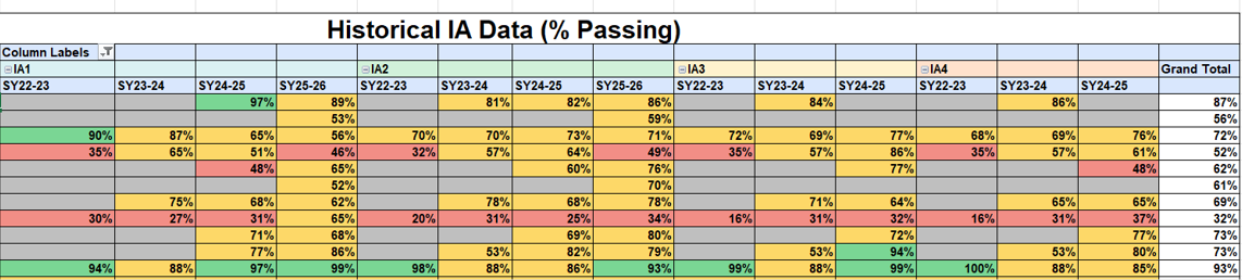
Example of pre-aggregated reporting that masked longitudinal trends.
The Objective
The objective of this project was to design an interactive analytics solution that enabled district leaders to move beyond static reports and analyze performance trends over time.
Specifically, the solution was designed to:
Visualize longitudinal performance at the teacher level, rather than isolated assessment results
Classify performance patterns as increasing, stable, or declining
Enable dynamic filtering by grade band, department, course, and school year
Shift analysis from static numbers to clear, decision-ready visual narratives
The goal was not just to report results, but to support more informed, trend-based decision-making.
The Approach
Approach summary: Built a structured, repeatable analytics workflow using row-level assessment data to support longitudinal, teacher-level analysis.
To address the limitations of pre-aggregated reporting, I worked directly with raw IA and GMAS datasets rather than relying on Excel pivot tables. This enabled deeper longitudinal and trend-based analysis across multiple school years.
My approach included:
Data preparation and cleaning
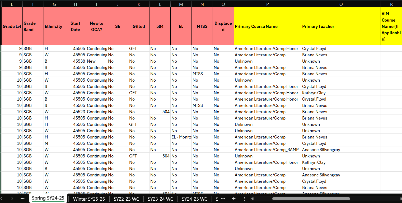
Requested and worked directly with raw datasets spanning multiple years.
Verified record completeness across teachers, assessments, and school years
Cleaned the data by removing duplicate records and resolving inconsistencies in teacher identifiers, course labels, and assessment naming
Developed calculated fields to normalize assessment performance across multiple testing windows, enabling accurate longitudinal trend comparisons.
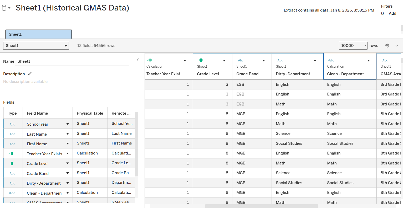
Data modeling for longitudinal analysis
Structured the raw data to support year-over-year and assessment-to-assessment comparisons
Created calculated fields to track performance changes across IAs within a school year and across multiple years
Established consistent sorting and ordering logic to preserve instructional timelines and assessment sequences
Visualization and interaction design
Built interactive Tableau dashboards that allowed leadership to filter by grade band, department, course, and individual teacher
Developed trend classifications (increasing, flat, decreasing) to quickly surface teachers whose student performance was improving, stagnating, or declining
Designed views that made growth patterns, outliers, and long-term trajectories immediately visible without requiring technical interpretation
This approach transformed raw, multi-year assessment data into an executive-friendly tool that supported exploration, comparison, and data-informed decision-making at the district level.
Raw assessment data required validation and standardization before longitudinal analysis was possible.
Skills Applied
Data Cleaning & Validation
Standardized identifiers, resolved inconsistencies, and validated multi-year assessment records to ensure accurate longitudinal analysis.Longitudinal Data Modeling
Structured row-level data to support year-over-year and assessment-to-assessment comparisons at the teacher level.Trend & Pattern Analysis
Classified performance trajectories as increasing, stable, or declining to distinguish sustained trends from short-term fluctuation.Dashboard Development (Tableau)
Built interactive dashboards with multi-dimensional filtering to support exploration by grade band, department, course, and teacher.Stakeholder-Focused Analytics
Translated complex performance data into clear, decision-ready visual narratives aligned to leadership decision-making workflows.
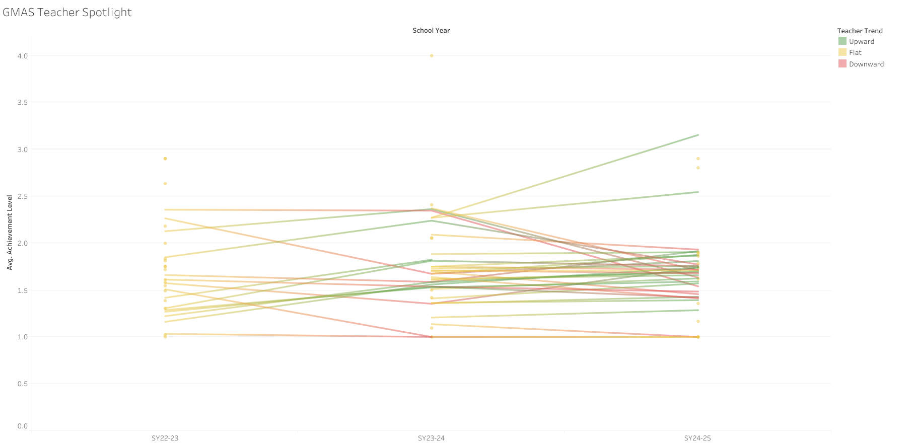
Early iteration (high visual density)
Refined iteration (clarity & trend visibility)
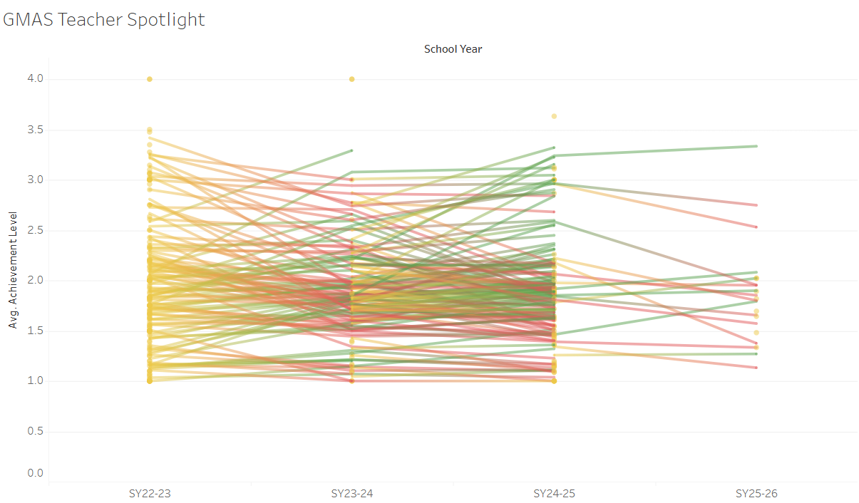
GMAS Dashboard
The GMAS dashboard focuses on longer-term outcomes, providing a summative view of performance across school years. Because GMAS is administered annually, this view emphasizes year-over-year trajectories rather than short-term fluctuation.
Key features include:
Multi-year performance trend analysis at the teacher level
Consistent trend logic aligned with the IA dashboard
Contextual filtering to compare patterns across grade bands and departments
Together, these dashboards connect short-term instructional signals with long-term achievement outcomes, enabling leadership to interpret performance trends with greater clarity and confidence.
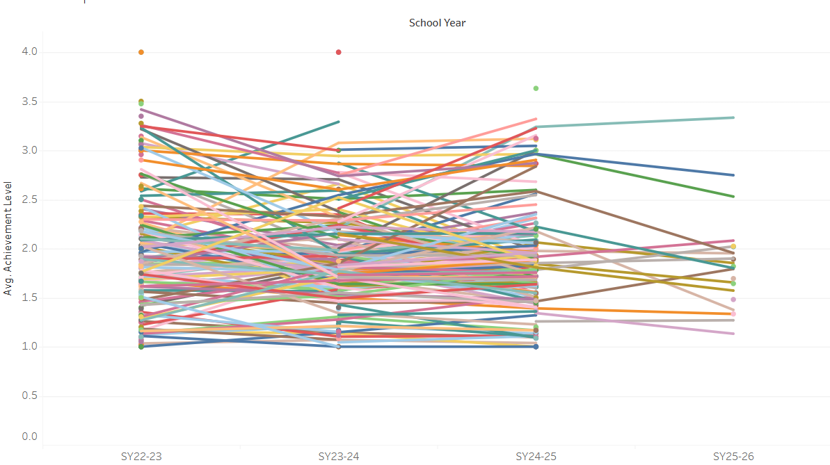
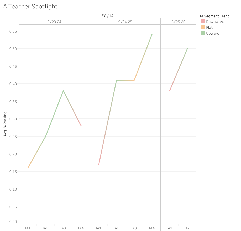
Example of teacher-level IA trends highlighting short-cycle instructional response.
The Solution
To address these challenges, I developed two complementary Tableau dashboards—one focused on Interim Assessment (IA) data and the other on GMAS data—using a shared analytical framework and consistent design logic.
Design rationale: Interim Assessments (IA) and GMAS serve different analytical purposes. Separating the dashboards preserved contextual accuracy while allowing consistent trend logic across short-cycle instructional signals and long-term outcomes.
Although both dashboards analyze performance trends over time, this separation allowed each view to remain easier to interpret while still supporting meaningful comparisons across school years.
Interim Assessment (IA) Dashboard
The IA dashboard was designed to capture short-cycle instructional trends within and across school years. With multiple assessment points per year, this view allows leadership to see how teacher performance shifts over time in response to instruction, pacing, and intervention.
Key features include:
Assessment-to-assessment trend visualization within each school year
Trend classification to surface increasing, stable, or declining performance
Filtering by grade band, department, course, and teacher for targeted analysis
Key Challenges
Pre-aggregated reporting limited longitudinal insight
Initial access to the data relied heavily on Excel pivot tables that summarized performance at a single point in time. While technically complete, these summaries obscured year-over-year patterns and made it difficult to distinguish sustained trends from short-term fluctuation.Inconsistent identifiers across datasets and years
Teacher names, course labels, and assessment structures varied across school years and data sources. Without careful validation and standardization, these inconsistencies introduced significant risk of inaccurate comparisons over time.
Design Iteration: From Density to Clarity
Initial dashboard iterations revealed challenges related to visual density when displaying hundreds of longitudinal trajectories simultaneously. Iterative refinement focused on reducing noise, improving readability, and surfacing meaningful patterns without sacrificing analytical depth.
Key Insights & Impact
The dashboards surfaced patterns that were difficult to detect using static reports or single-year views. By visualizing performance longitudinally, leadership was able to shift focus from isolated results to sustained trends over time..
Key Insights
Performance trajectories were more informative than single data points
Teachers with similar scores in a given assessment often showed very different trajectories across assessment cycles. Viewing growth patterns over time provided a clearer picture of instructional impact than snapshot comparisons.
Short-cycle IA trends often not aligned with long-term GMAS outcomes
In many cases, trends observed in Interim Assessment (IA) data did not directly translate to GMAS outcomes. Teachers who showed short-term gains or declines across IA windows often demonstrated different patterns in summative GMAS results.
This highlighted an important distinction between short-cycle instructional signals and long-term performance outcomes, reinforcing the need to interpret IA trends as contextual indicators rather than direct predictors of summative result
Trend-based views helped prioritize support more effectively
Rather than reacting to isolated low scores, leadership could identify teachers showing sustained decline and differentiate them from those experiencing temporary fluctuations. This allowed for more targeted coaching and resource allocation
Context mattered
Filtering by grade band and department revealed that performance patterns were not uniform across instructional contexts. This helped leadership frame conversations more accurately and avoid one-size-fits-all conclusions.
Impact
As a result of this work:
Leadership moved from manual spreadsheet review to visual, repeatable analysis
Conversations shifted from “How did this assessment go?” to “What is the trend over time?”
Data was used more consistently to inform instructional planning, coaching, and decision-making
The dashboards became a scalable framework that can be reused and extended in future assessment cycles
Reflection & What’s Next
This project reinforced the importance of designing analytics around decision-making, not just reporting. While the dashboards successfully enabled longitudinal insight, future iterations could focus on automating data ingestion, introducing alerts for emerging negative trends, and expanding segmentation to better support proactive instructional planning. If extended further, the next phase of this work would focus on:
Incorporating additional contextual variables (such as enrollment changes or course placement) to better explain variation in trends
Exploring more formal statistical methods to quantify the strength and stability of observed trajectories
Future iterations could include automated ingestion and SQL-based transformations to support near–real-time monitoring of performance trends..
Most importantly, this project demonstrated how thoughtful data modeling and visualization can turn underutilized historical data into a practical decision-support system. Rather than replacing professional judgment, the dashboards were designed to inform better questions, support more targeted conversations, and encourage evidence-based action.